The Neon Graveyard - Part 8 - Atmosphere

Work In Progress / 09 May 2019

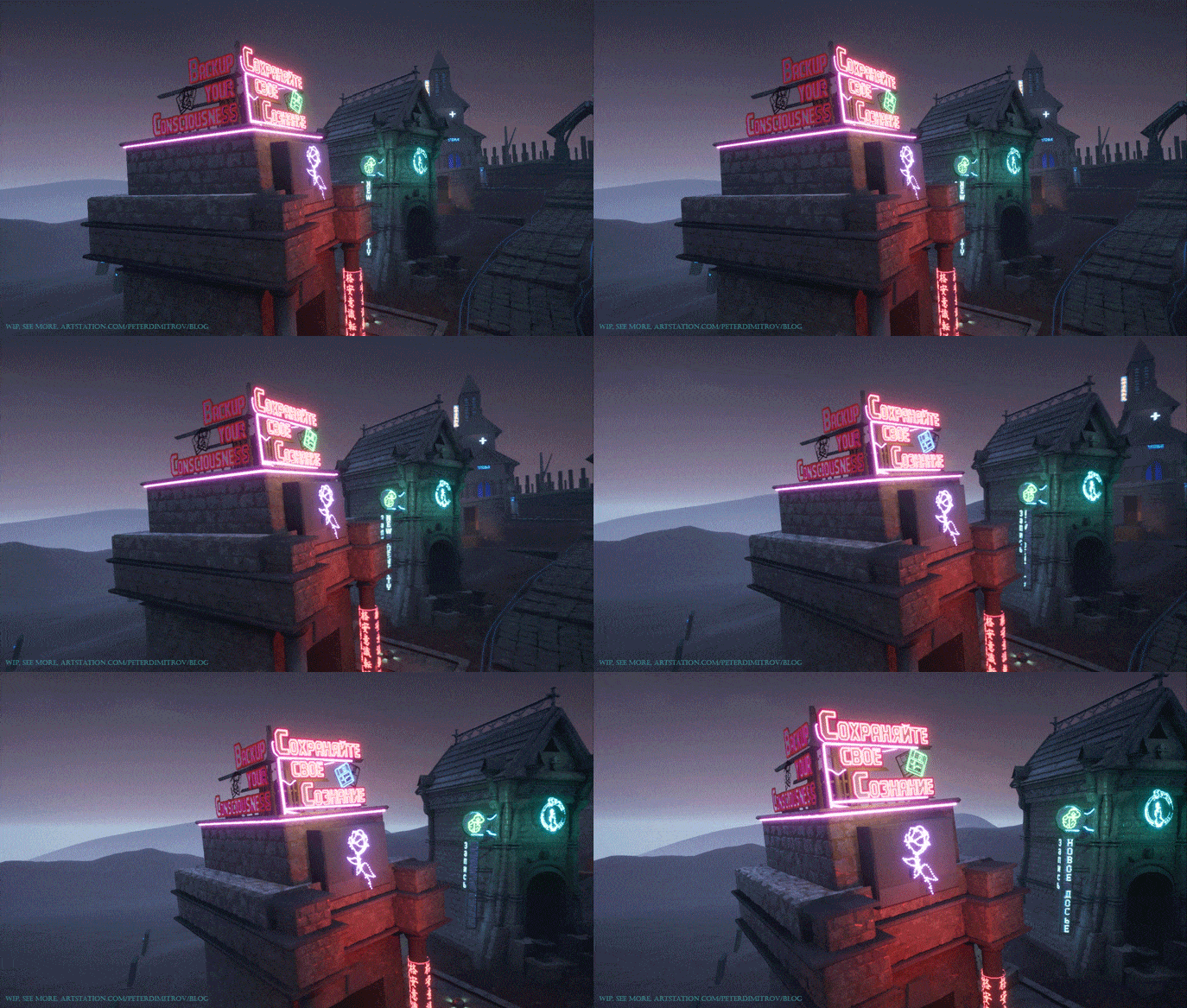
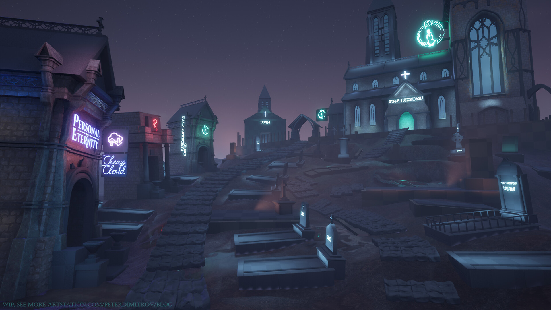
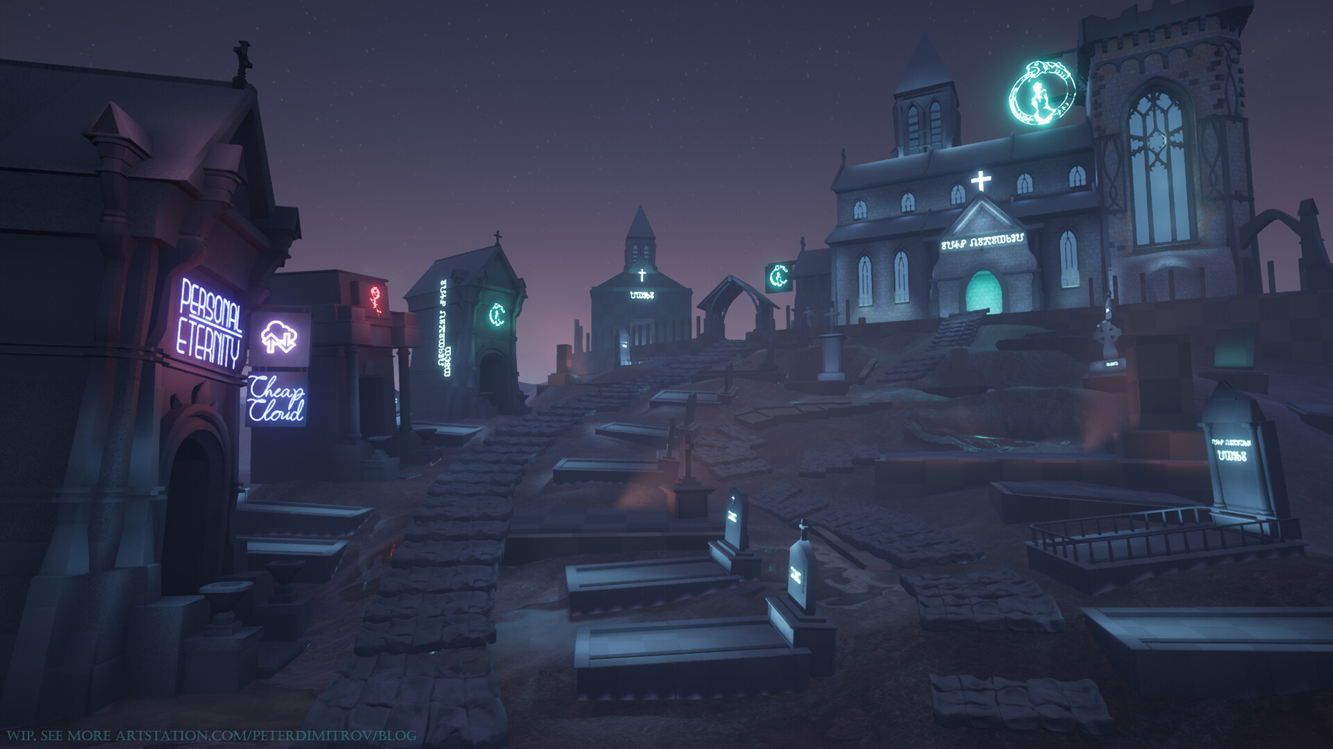
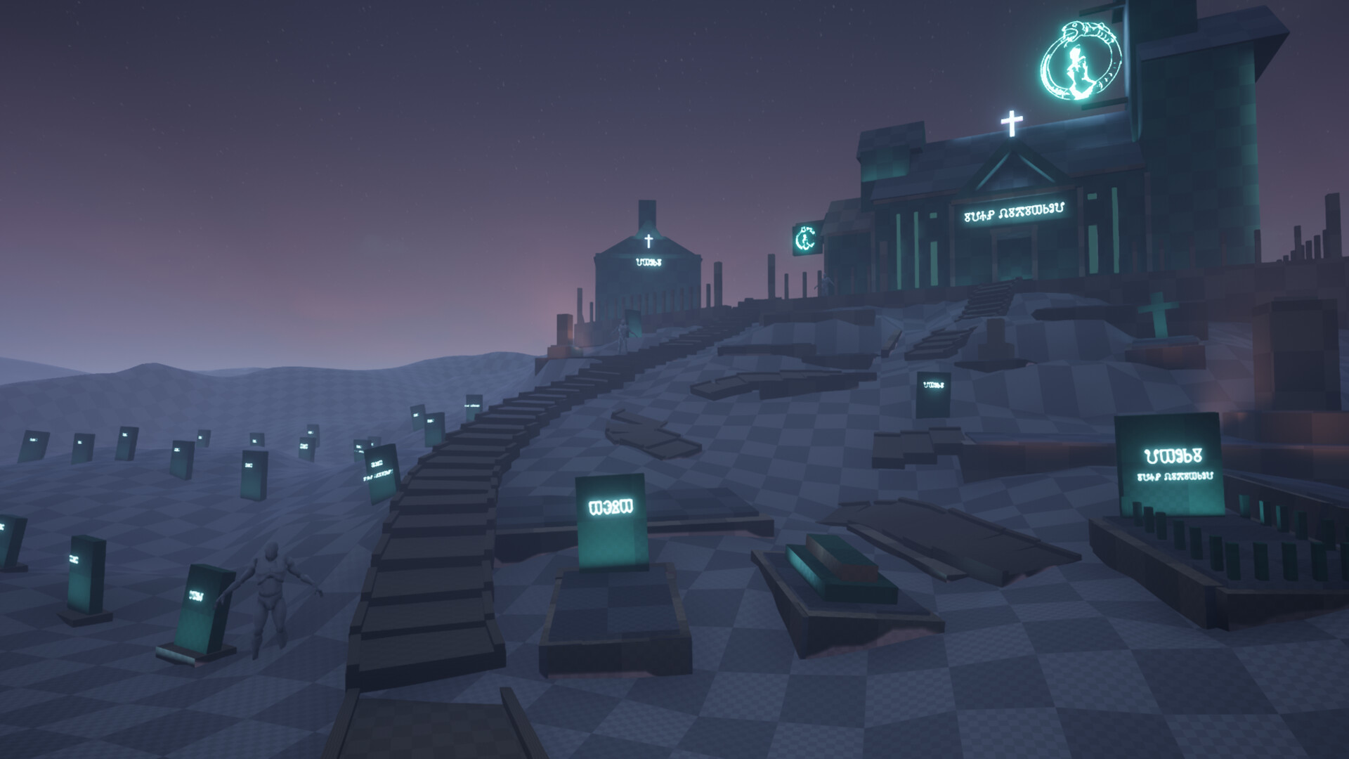
If you remember the scene from last time, you would probably notice that it looks completely different. That is, looking at the atmosphere, at least. The layout is more or less the same.

Mist.

I had this idea, of having mist just above the surface, since the very start. I purposely postponed it until now, though, as I didn't want to get crazy with tweaking volumetric fog settings, alpha and fog cards and putting crazy amount of time in it, whilst not having the basic layout figured out or any of the props ready. But now, when nearly all of the props are ready, I had the time to sit down and work on vapor and smog.

For anyone wanting to recreate this, the ground mist is just a very large Particle Emitter. Its tied up to a Clouds texture, pans a tiny bit, has a pretty short lifespan and is spawn cylindrical. After that its just a matter of tweaking your Volumetric Fog settings in your Exponential Height Fog volume. I'm pretty sure the guy in Epics video (14th minute mark) about Volumetric Fog in the Engine quickly recreates something very similar. The only part I added myself, is how I placed it in the world. It's just below the surface of my Landscape. And that's how I made it look like ground mist. 

Stained Glass.

Another, very important addition since last time, is the Stained Glass material that I created. It's made from scratct in Substance Designer. What you see here is version 2.0, as the first one I created, I abandoned after a bit, as I though its shape was too simple. It had a diamond pattern going for it, and I wanted something more intricate looking than that.

My main approach to it was creating a base pattern and then picking up different areas of it and applying a few individual Flood Fills. Each Flood Fill is turned to Color and then the hue, saturation and lightness of each shape that the Fill has picked up is randomised. The tricky part was giving it a shining look afterwards, in the Engine. If you look at just the material "ball" in Substance, it doesn't look like much on its own. To give it that emissive look, I masked just a small portion of the whole patter. I applied another Flood Fill (by now third) and gave it sharp, stained masked noise with a Slope Blur.

I'm particularly happy with this approach, and it gave me one thing I didn't anticipate and wasn't aiming to achieve. If you look at the texture up close in Unreal (the screenshot above), the emission mask is distinct and clear (white magenta bits). As you start going further away from it, though, the Engine shrinks the texture quality a bit, which blurs the emissive pixels. Those pixels then, start to work together with the Bloom settings of the scene, and fill the whole glass surface with a dark, electric, blue color.

(As I described, you can feed an outline of your pattern towards a Flood Fill. You can then use a Flood Fill To Color to randomise the HSL of each generated shape. You can see all of that in the screenshot above.)

If you are making a strained texture of your own, I would suggest experimenting with emissive mask, but also pay attention to your Bloom settings in the Post Processing Volume. A good combination of both, always makes for exciting results.

For the pattern of the texture, I was in parts inspired by Matthias Schmidt's techniques, which he shares over in his blog. Check that out too.

Other things.

Most things are ready by now. I still have a few objects to put textures to. The boxes that you can still see are placeholder for hopefully some statues of something looking like a weeping angel. I want one or two of those, to contrast the very straight shapes of the rest of the headstones. 

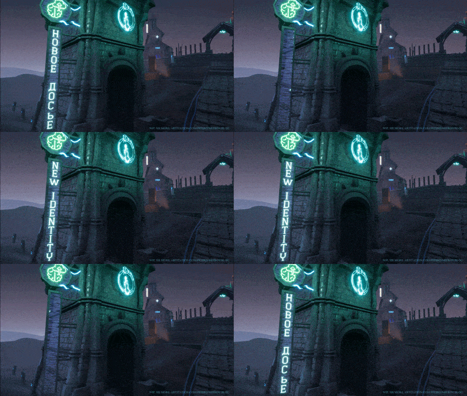
I'm also still working on the details of the main gate that you can see in the very first shot in this post. Facade details around the big window too.

Making this project has been quite a fun journey. I think this will be my last post about it though. As long as it goes about approach explanation at least. My next one 'hopefully' will be a gallery to showcase the final result. I'll be working on the video, to showcase the casket as well.
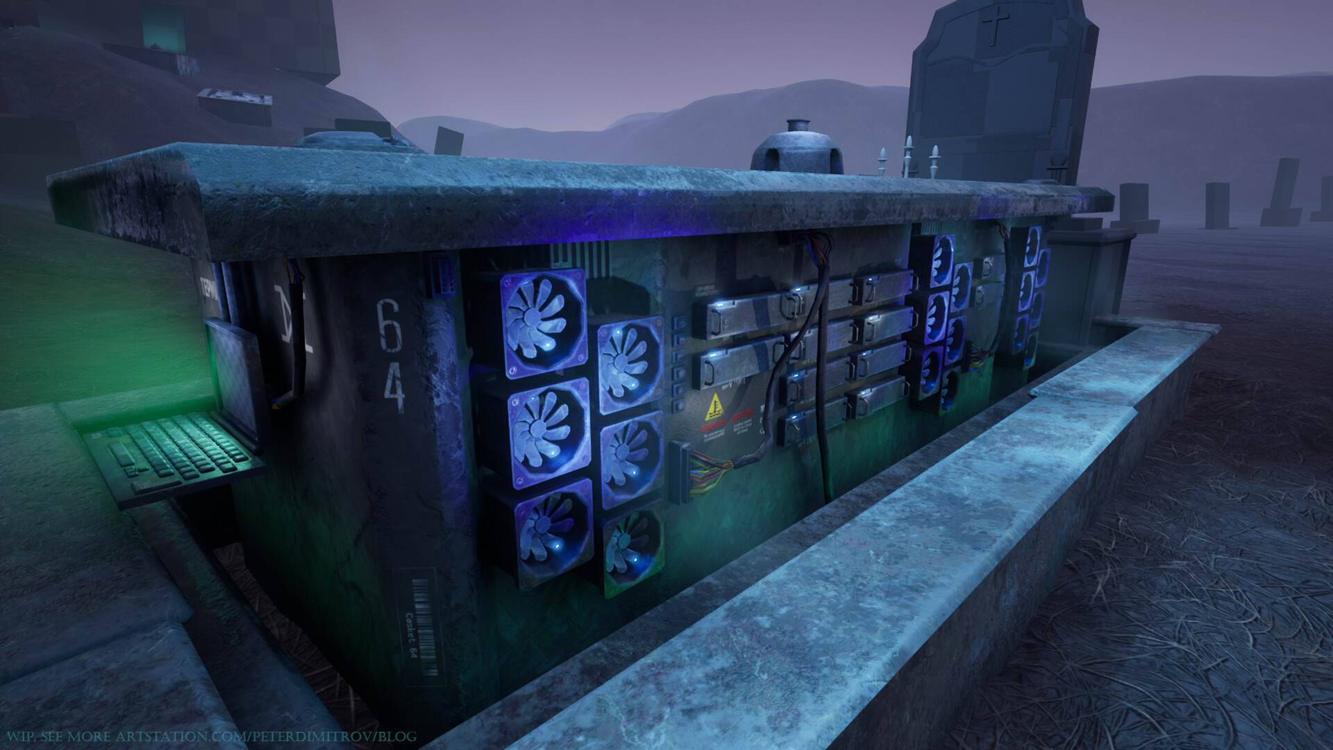
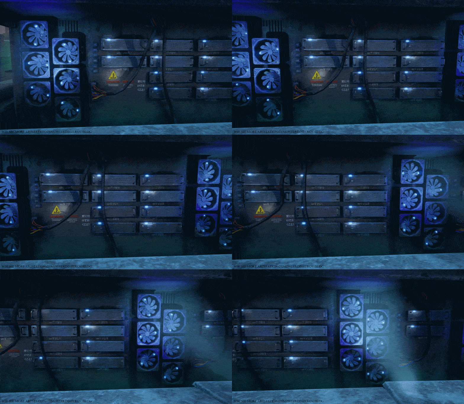
(Casket as seen from a few posts ago, as I have a feeling some of you probably don't even remember it. It's still here! Going to animate it for a final video.)

One of the reasons I started this project a few months ago, is my University. As such I'll be submitting it as a thesis in about a week now. So that's the deadline by which you will hopefully see the final result as well.

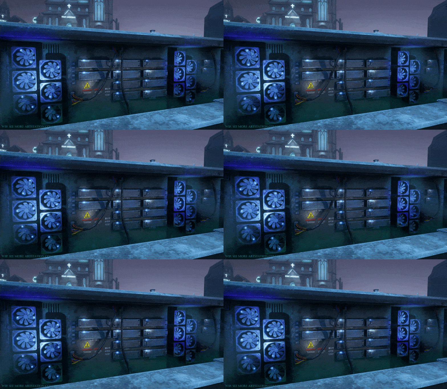
(Some of you know I'm a fan of progress GIFs, so here is a very compressed final one.)

Thanks.

To those of you who you stuck with me through the whole journey, and read all of the previous entries (about seven), I want to say thanks. I hope you found them useful and intriguing.

Pete.

The Neon Graveyard - Part 7 - Neon Signs

Work In Progress / 20 April 2019

After finishing the casket prop, I've had time to go back to the overall scene and continue working on missing props and details for the landscape. The other thing is refining textures and figuring out how exactly I'm going to tackle making the neon signs. Previously, my neons were just simple alpha cards with an emissive text. Although in its core that's what neon signs look like anyway, I wanted to put more attention and detail into them than just that. Possibly build a more complex material shader.

As the last two posts were about the casket, it's been a very long while since we've last seen the scene as a whole. As such I am just going to show you at what stage I am right now, and then we can talk about how I created the different bits.

The scene.

And just as a reminder - this was we had before (three weeks ago or so):

Neon signs.

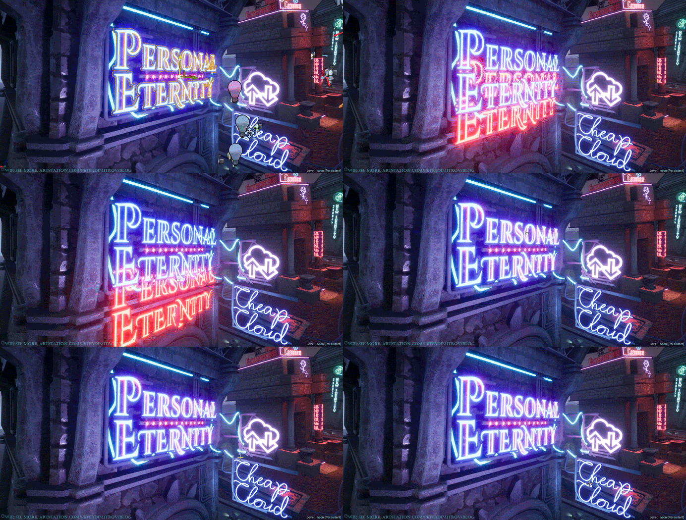
From close up, this is how the "Personal Eternity" one looks like:

And a few GIFs to show the animations I've put in the signs. (gifs are heavily compressed as Artstation caps the file size at a very low amount).

I intend to make some even more dynamic, by having letters flick. The metal mounts of each sign still lack textures, but that will be for later.

The text that's lit up is in Russian and reads the same way as the English one next to it "Backup your Consciousness". It's going to be a play on words as well, which I will animate for the final video. The idea I have in mind with that is about the text in Russian, appearing lit up fully at first - "Сохраняйте свое сознание". The whole sign then flicks on and off a few times, as if short on electricity. When it powers up again, its left with just "охраняй сознание". First and last two letters from the first word are off, second word is entirely off. And what we are left with reads from "Backup your..." to "Guard your Consciousness".


Making the signs.

At some point, I made the alpha cards of the neons into 3D objects. I made a few of the texts into actual geometry, but then when I inserted them in, you couldn't really tell from afar that they are dimensional and 3D. Going up close to them, most still looked relatively the same - flat. That's why I decided that there is no really point into turning them into expensive on memory 3D.

Plain text with an emmisive material was flat as well, and as such I went into trying to figure out another way to make them look better, more dimensional, and more neon-ish. That's when I though of trying a transparent text with a border. I then put a second border to that said border. The inner border, I assigned bright color together with emission. The outer border, I left dark. The fact that they are transparent from the inside, boosted the illusion of "neon". What I discovered then, is a trick I made up which turned them actually dimensional (sadly probably not very well seen in the GIFs due the small image size). I duplicated the text as it is in the world in the engine. I then offset its position by a few pixels backwards from the original position. To that second copy, I then applied an instance of the original material. In that instance, I can change the previously exposed parameters such as the colors of the inner and outer borders, as well as emission level of the glow. Then, by changing those colors, to ones completely different from the original, I managed to create an illusion of depth. The result is best seen when you move the camera while looking at the signs from a side. The secondary colors, from the text copy that is behind, leak and bloom softly. They contrast so well with the front text, that whilst you move, they make the whole text appear as if an actual neon, with dimension and shifts in the value and hue of its color. That effect is apparent even from the static shot seen above, that showcases the "Personal Eternity" neon.

The borders, I created in Photoshop using Blending Options - Stroke. To keep everything optimised, I suggest making those masks into a single image. In the image above, I've put the two different borders, onto two channels - one on Green, the other on Blue. In the material shader, I simply take those channels and assign them color and emission value.

I've showed you how I do this with a single text - "Personal Eternity" taking a whole bitmap of 512x512, but for this project, I actually keep every text and neon design, into one single image. In a 2k texture, you can fit much more than you would think, and using every channel - R, G and B - allows for even more effects and optimisation.


Headstones and other props:

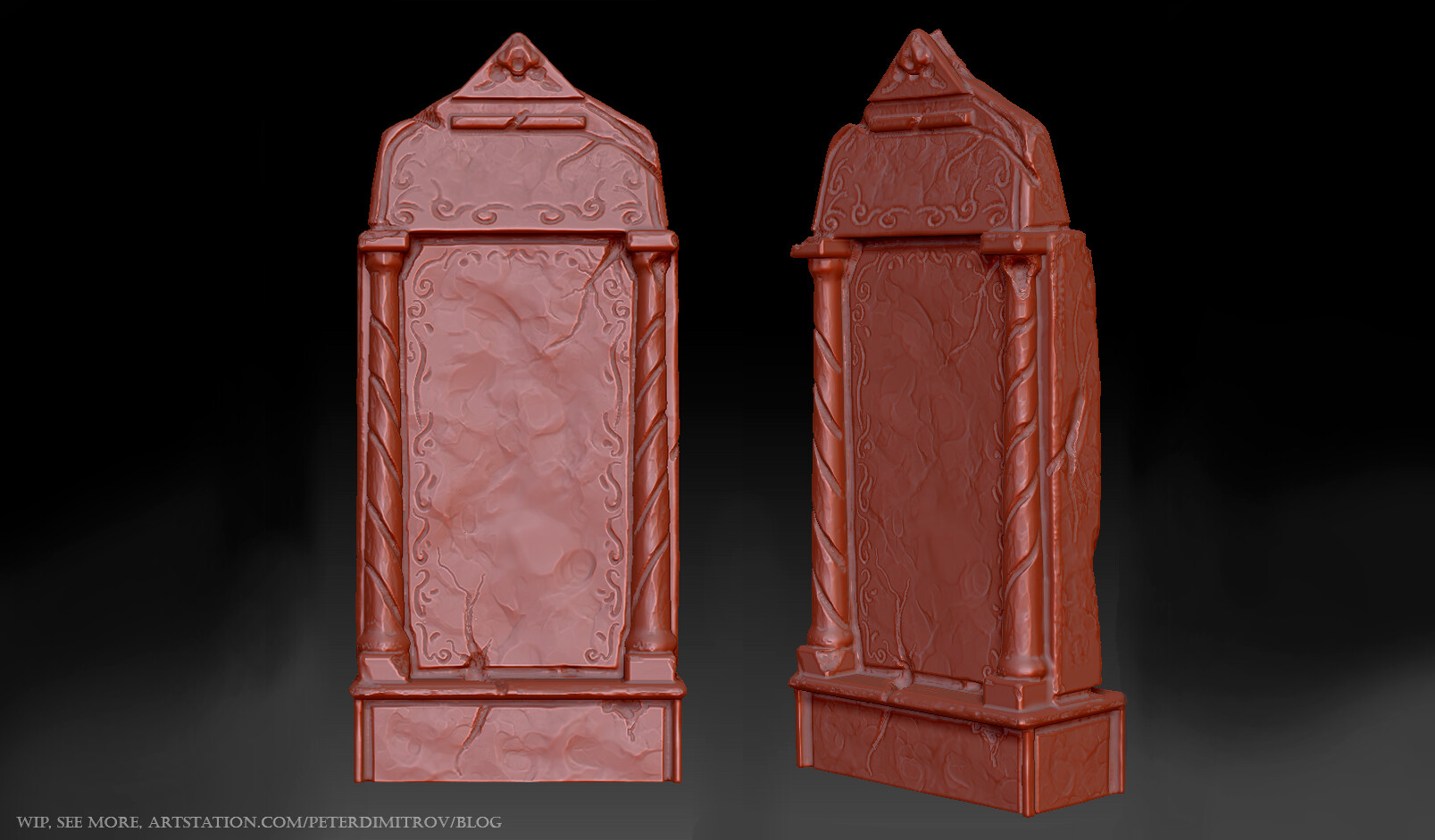
In Zbrush, I imported low-poly models of headstones that I created in Maya. I turn them high-poly by dividing the geometry with smooth off. I then sculpt detail on that and when I am happy with the result, I create a new, low-poly version, by decimating the typology. For that, I use Decimation Master, that can be found in Zbrush.

The headstone seen below, I decimated from 2.3m tris to 2k using Decimation Master. When you go to poly that low, you can freely take the model in Maya, and UV map it by hand. 2k tris is not too much, and as such the automatic mapping in the newer versions of Maya does quite a good job. It takes most of the flat surfaces and gives you whole UV islands, and it leaves just a few weird triangles here and there, that you can quickly sew back in place. Small edges with lots of damage on them, usually get mapped weirdly too, but you can go over those and fix them with relative ease.

Later on, I'm thinking of giving the weird letters on the headstones, actual metal mounts and have some cables run towards them from the ground. Right now they sort of give the vibe of magical runes.


Other things.

For the landscape I've scattered some detail using small rocks, broken pavement as well as some cables. I've created the cables as a spline system, and although it took a bit of time to place as many copies as I've done, it was very fun to do. Obviously, I tried having them glowing at first, but decided against it as it was getting a bit too much in the way. Their texture might still need some more work though.


The cathedral in the distance will still need some more attention. I'm thinking of some decals and props to scatter and give variety and detail both to the roof and to the walls. The windows will have stained glass material to them, with an emissive mask. I'm hoping to achieve some electrical whimsical colors, to fit the Cyberpunk vibe. I've left them for this late on, as I already have plans on how to create them in Substance Designer. Working on materials like that is probably one of the things I enjoy most in 3D, and frankly said, that's why I am keeping them as a treat to myself after I get the rest of the important things done.


Hope you found this post insightful and interesting. Until next time,

Pete.

P.S. My abilities in the Russian language, are limited to the few lessons I've had years ago, back at home in Bulgaria. As such I want to thank Alexey Shiyan for double checking my signs, and assuring me, that my whole idea behind the play on words, actually works. : )


The Neon Graveyard - Part 6 - Textured Casket

Work In Progress / 31 March 2019

Last time I showed you a just completed as far as it goes in terms of geometry prop. The weeks after that I've spent on creating materials for it and actually texturing it. I've done a few changes on the overall scene as a whole too, but this post will be once again mostly about the "Cyberpunk Casket".

The Casket in Unreal.

It's been a slow process as I've been making everything from scratch. I've been building up my own "library" of materials as well as alpha masks for shapes like the writings, protrusions, retrusions, labels and more decals of such style.

When I build scenes in Unreal, they rarely consist of props made to be scrutinised from very up close. I knew from a long time, though, that I want this model to be the focal point of my showcase video. I want to tell a story of sorts, and this prop will be my main actor. That is why I've went quite higher in detail (both in geometry and texture density) than I usually do.

Right now, the prop sits at a bit less than 17k of geometry. I'm quite happy about that fact, as I though it would be much more costly. The fan piece is understandably expensive (500-600 tris), but its instanced and as such is loaded into the memory only once. I call it into a custom Blueprint to animate it so it spins around.

Another GIF:

The screenshots you see are from Unreal. There, I've made my own light set-up, which is still not final, but is getting there.

Materials.

Here are previews of a few of the materials I created for this prop. Some are actual final materials with full bitmaps channels for PBR, but a few are just patterns I created and then used in Painter to blend more normal and height detail into the prop (an example would be the dotted pattern).

First material is the one I used the most. Its a plastic with a simple anisotropic noise to give it a better feel. Taking it into Painter, I've duplicated it, changed its color to lighter, changed the direction of the anistropic filter and I've put a smart mask on it. The result is not seen here, but can be seen further up, in the first screenshots. I've build up the fan material like that. Second is a triangular pattern I used to give some visual noise. Most of the time it might not be noticed as I've put it to around 20-30% opacity. Just enough to build up some interest. Dots are what you see on the servers, and the last one is electrical tape for the cables.

Iray renders.

Here are some screenshots from renders I ran in Painter. Bit fizzy here and there and with quite a few white pixel artifacts, but this will do for now. I will make better passes at the end.

Tell me how you find it so far.

Until next time,

Pete.
The Neon Graveyard - Part 5 - Cyberpunk Caskets

Work In Progress / 11 March 2019

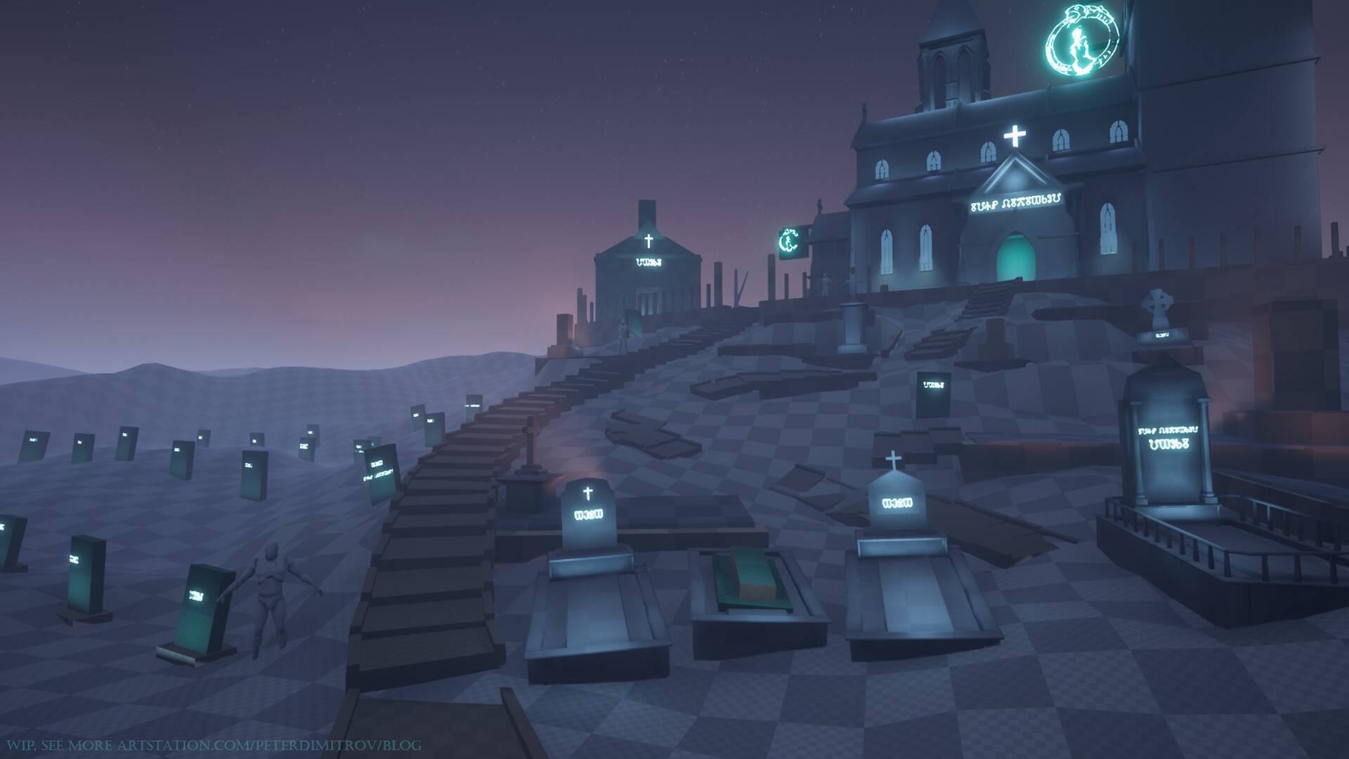
The view from the main camera. Started putting the brick textures from the last post in. Also created a metal trim to go on the mausoleums roofs.

Cyberpunk Gravestones.

The more interesting part though, is that I started development on the gravestones.

My idea from the very start of the project, was to create a spacious environment and then showcase it in some interesting video with nice camera movements and maybe even some basic animations. While working on the layout and general mood, I was thinking all the time on what I want to do with the gravestones themselves. I knew I wanted to turn them in some weird, cyberpunk devices that serve a purpose.

At first look they appear ordinary (apart from the neon signs, and the disc looking device) but upon close inspection you see there is something that might be going on with them.

The concept.

The holes of the gravestones will look like any ordinary ones. The camera zooms into one though and some movements starts. The entire hole, in which a casket would go, starts moving up. Pressure release sounds plays and some vapour particle systems triggers. With the upward movement we suddenly see the side of the "coffin" and realise that there is something weird to it. Lots of wires run through it, connecting cooling systems and servers together. Lots of small lights flick on and off.

The middle prolonged shapes (seen in the picture above), I want to give the look of as if they are storage space (digital ones, of course). Hopefully I will find a nice way to wire up the gravestones with some cables that go towards the cathedral itself. If that is visible from the main camera, the viewer could have a hint towards those gravestones way before the camera zooms in and the whole sequence I described plays.

At the very front of the "casket" I put a terminal. Going to have some fun animating the screen with some weird numbers and code showing later on. Also, texturing that keyboard should be quite interesting too.

I want to have this whole prop be quite more detailed in both geometry and texture, compared to what I ordinary do. In a way that its obvious that its a prop, meant to be inspected from very up close in a first person game. I'll still do my best with optimisation too, nothing is going to be too crazy (the spinning fans, which are the most heavy on geometry objects, would be an instance of a single object, and I will animate them to spin in the sockets).

I've UV mapped a big chunk of it already and I hope to have some interesting stuff to show next time. In the meantime, tell me what you think of the idea and the general look of this "casket" so far. Hoping to bring it to life with lots of cyberpunky lights and wires.

Until next time,

Pete.

The Neon Graveyard - Part 4 - Landscape and Bricks

Work In Progress / 22 February 2019

The past week has been kind of slow as I've been busy with a few other things (like playing Apex Legends... :P). I did some work on detail pieces and protrusions on the cathedral. Then I had a go at making some initial textures in Substance Designer.

I put in a tessellated landscape blending material in, ready to take on a few more textures when they are ready. The muddy one you see is one I created for my Feudal Japan project. I think I like the wet, reddish look though, so I might keep it like that but give it more variety with a second texture.

Facade.

I did figure out how I am going to approach the facade of the buildings though. Or at least those of the ones in the distance, still not certain about the mausoleums. I decided I will make some basic brick textures, make a few variations and vertex paint detail on top. But that will be kind of too flat and boring. As such I am going to make some decal planes to go on top, and those I will model in Zbrush, the bake between two flat planes in Substance Designer and color/texture them. If I manage to make some interesting stone ornaments and create a good normal map out of it, it should give plenty of definition.


The blue bits are where the alpha cards/decals are gonna go. I'll most likely scatter more than what is seen above, but that is just an initial sketch of the idea to guide me along the way. The photos you see to the right and left are what I will try to sculpt and place on those alpha cards.


And here you can see the brick texture I quickly made in Substance Designer. They are famous, brick textures, aren't they. Or I feel more like infamous. Everyone, pro or amateur alike always has a point of their career where they make one. I guess this is another one of mine going down in the records.

I did a parallax occlusion shader for the bricks in Unreal. It gave it a very good dimension but then I decided I don't want to bother spending ages making a vertex paint blending material that is also parallax occluded. Not only will it be super expensive performance wise, but also from the distance shot I am going for, you can't really notice the detail it gives. It was a nice exercise nonetheless.

I think I might spend more time in Substance Designer, making a few more brick variant textures. A few maybe quite different than the ones above. More smooth, with jarring whitish color and greater variety in roughness. I'll then blend those on patches on top to give even more variety. And if it still looks flat I might even invest in a few patches of brickwork that is actual geometry. I'll make them sort of modular/kit bashing in fashion and then scatter detail with them on the facades. 


Until next time, when I hope I will have more exciting than now progress,

Pete.
The Neon Graveyard - Part 3 - Mausoleums

Work In Progress / 11 February 2019

Week three.
I've been blocking out more shapes and changing the lay-out quite a bit. I'll be honest and say that I liked the idea of having bare land to the left of the camera, and filling it with just squarish, ordinary looking gravestones. Exactly like the cover of the short-story I mentioned in the first post. Then in the distance, I would have spooky, aggressive treeline. And although trees are nowhere to be seen yet, I was worried that they wont fill the scene up enough when I create them. I was bothered that there would be this huge patch of sky to the left, and it would distract the viewers eye out of the canvas, instead guiding it towards the inside of it.

Crypts and Mausoleums.

That's when I thought this would be the perfect opportunity to introduce some crypts, instead of having only gravestones. And even better, their prolonged silhouettes and roofs would give me more space to put on some neon signs. I had the intent to have lots of those lights from the very start. At some point I started wondering where I am going to put them, and this kind of fits.

They need quite a bit more detail and work, but at least their block-out shows me where I am going with it. With the neon billboards I want to suggest a story. Thus the "Personal Eternity" and "Cheap Cloud". The place doesn't look very techno heavy a part from the lights right now, but I plan on scattering some cable and wire details through some Unreal spline systems. They could go out of the cathedral and go towards each grave. Maybe those graves actually serve a purpose? Is there something in them? Servers? Storage space?

Haven't figured out all of it yet, but just asking those questions and suggesting those ideas help me build the place up. 

Ah, by the way, that "Personal Eternity" text font to the right looks maybe a bit too Art Deco, and might really be calling for a change.

2D Sketch.

Before making all of the mausoleums, for a bit of time, I felt a bit lost and wasn't sure where I am going. I mean, I knew what I wanted, but I got worried that it might not end up looking like what I had in mind. That's why I took a screenshot from the project and decided to quickly bash a few photos on top and have a go with sketching the lights in Photoshop.


I really wanna have a go in Substance Designer at making the emissive, colored, stained glass on the windows at the distance, but that will have to be for later as there is much more to do before that. Also I settled down on the idea that it might be cool to have a tower in the middle of the canvas. That needs to be blocked out next.

Time for a GIF!

I was really unsure whether to keep the graves face the camera like I had them initially. I think it was not that bad but certainly feels a bit banal at times. Like, lets have every cool thing look straight into the eyes of the viewer. What I've settled down on right now, I believe looks more dynamic. Might still not be the final, as I feel like their placements lacks structure. Even though I am trying to convey the idea that its an old place and the soil started shifting and thus moving/distorting everything.


That's for this time. Hope you like where its heading. Until next time,

Pete.

The Neon Graveyard - Part 2 - First blockout props

Work In Progress / 03 February 2019

First week progress. 

A few days passed since the last blog post about the project. I am back with some progress on the blockout. The first very notable thing is that the Church (or more like Cathedral, judging by its size, scale and type of architecture) actually looks like something now. I've worked on it quite a bit but we are still in the phase of weird mixture of modelling bits that are finished but need texturing and tiny bit more detail, and others that are still placeholders.


I've been tweaking the scale of the different volumes for each part of the building. I don't want it too massive, as I am limited on how long I can work on the project. At the same time I don't want it dull and tiny. Above you can see a view from Maya. I don't have it as one big chuck in Unreal. I've split it into multiple files so I can optimise the textures and light maps better later on.


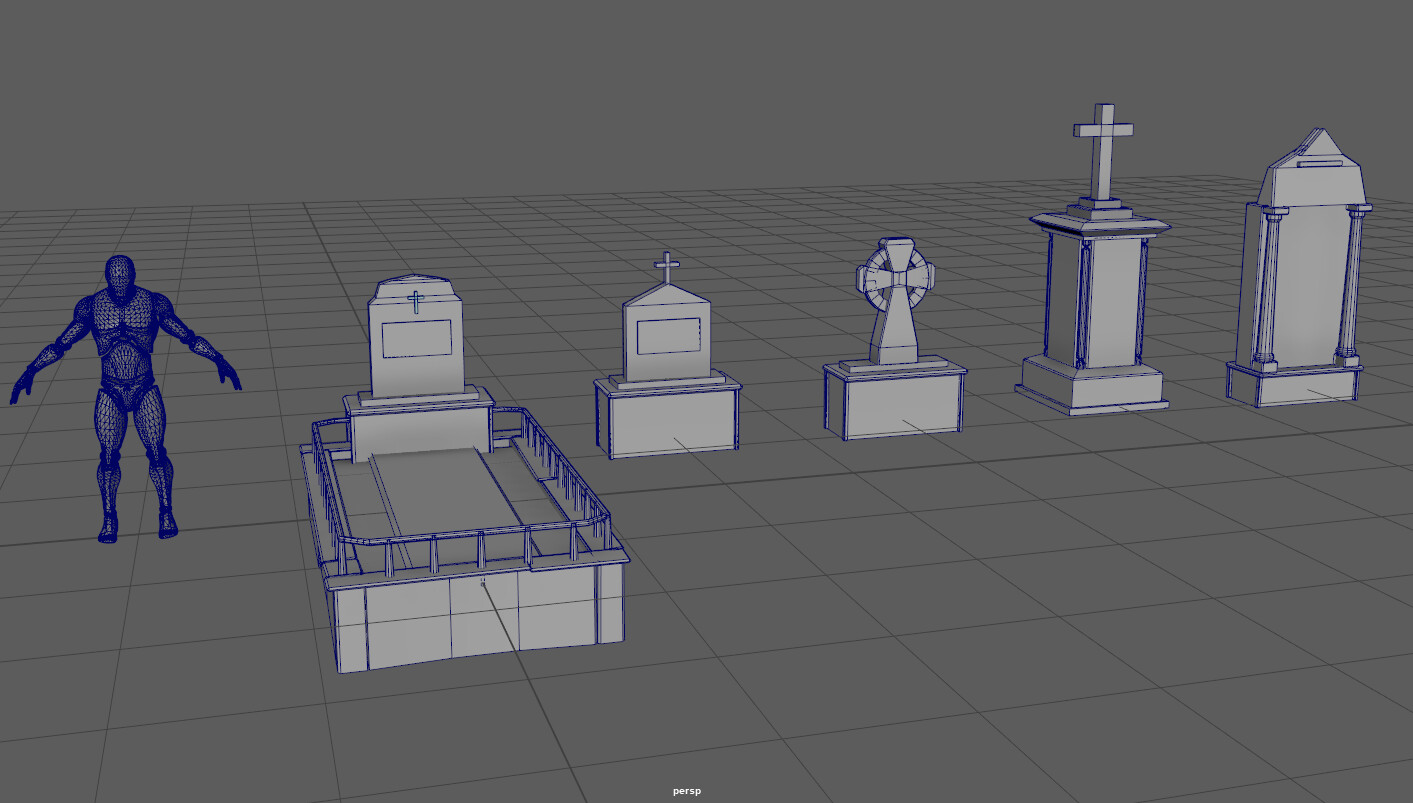
The initial idea was to have all kinds of graves with variety of gravestones on top scattered all around. As such I've been modelling some of those. 

I will most likely still be tweaking their position so I can make the best composition in the main shot of the whole place. I'll also work on more detail with the texts and neon on them.

Scripts and symbols.

As I promised in my last post, lets dive into what exactly the writing that I've put in right now stands for.

My initial idea was to change the inscriptions on each gravestones with a Neon. I though I might try a fancy looking script. The ones that can be seen in old-fashioned movies and neon signs. Then I started to wonder, what would I write on those gravestones? Names? I mean, that's what goes on gravestones, right? I decided I will have to create some random, obviously fake names (so no one sees a name of someone they know and gets creeped out, or even worse, offended). And because I want variety and more Cyberpunk-ish vibe, I thought I might try a few different languages too. That's when I decided it might be fun to try something very, very old. To try to use a script that exists and is real, but is no longer in use.


That's when I looked back into my native language for some inspiration. Bulgarian uses Cyrillic alphabet. To quickly introduce you to it, I'll quote Wikipedia

The early Cyrillic alphabet was developed in the First Bulgarian Empire during the 9th century AD at the Preslav Literary School by Saint Clement of Ohrid and Saint Naum and replaced the earlier Glagolithic script developed by the Byzantine theologians Cyril and Methodius.

And now, next time you see Russian, you will know that their script has origins quite deeper and further away, into lands different from their own, and more close to those of my home, Bulgaria. But I don't have you here to bore you with History lessons. Soooo, back to the topic at hand!

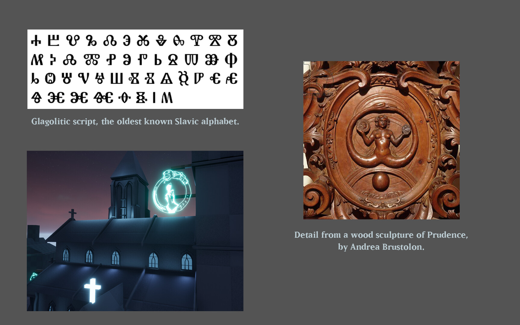
The so called Glagolitic script is what I was after. I thought that its weird visual look might add quite a bit of interest to the scene. Another fun detail is that I can actually write real phrases with it, as Glagolitic has its script correspond to Cyrillic letters with exact match in sound and use. But I don't think I will dive in that too deeply for now.

Going away from scripts and languages, lets mention what the neon sign on the very top of the building stands for.

I want to have different symbols and signs in neon on the top. I've thought of multiple ideas I might try later on. One was to create a logo and design that implements the infinity symbol in it. To sort of broadcast towards the viewer the idea that this Cathedral is a place of technology. Old and abandoned but afterwards repurposed, as I said in my last post. And maybe, in it, in this Cyberpunk world, people cheat death. They augment bodies to make them immortal. If said bodies get damaged irreversibly, maybe they transfer consciousness into new shells. I decided infinity sign might be a bit dull and is kind of overused. That's when I remembered about the Ouroboros. Which basically translates to the same idea, but looks much more mystical and cool, we can agree I am sure. And when I was searching for some inspiration on that, I came across by a wood sculpture detail from Andrea Brustolon. It implements the idea of a snake eating its own tail, and also has a female body in it. What a cool idea, I thought! 

I can make my own version and convey the idea of infinity through the creation of new bodies through science. But I will have to work more on the designs later on.

And because I just love GIFs, lets have one now and see the progress so far:


Hope you are finding the progress, and reading about it, interesting. Dev log number two out, until next time,

Pete.


The Neon Graveyard - Part 1 - Idea and Research

Work In Progress / 26 January 2019

Beginning of a new Environment.

Starting a new environment, I decided to share the creative process with anyone out there that might have an interest. I'm going to try to share a lot of development images. Not only I want to show you the thing though, but I want to tell you about it too. As such at times I will be wordy. I hope that if nothing else, you find it at least intriguing. 

We are making quite a sharp turn, going from way back in 15-16th century Feudal Japan to the not so distant future. A ruined, probably abandoned cemetery. On the very top of its hill, a chapel stands proud. But there is a weird, modern twist to this. The world in which this place resides is a gritty, Cyberpunk world. One full of neon signs, electric colors, rain and vapour. The churchyard has been repurposed.

First screenshot looking at the project. Yep, you are not wrong, there is nothing of what I described above as an atmosphere in this. Not yet at least. This is an early greyboxing level phase. But before I show you more screenshots, in this first blog post, I want to first talk about the source of the idea.

Neon Lights.

I got the initial idea (that changed a lot) from a magazine that I grabbed from a shop I randomly visited at the centre of London last summer. It's the sort of store, where you see an original Marvel comics from now nearly a century ago displayed at its showcase window and you immediately think that its a place you gotta walk into. The magazine I bought is Analog Science Fiction and Science Fact, or that's what it used to call itself back in November 1972. That's when the issue I got was first published. It's cover painting is what allured me to buy it though, more than anything else.

I loved the "retro sci-fi" vibe of the painting. Cemetery World, it said. By Clifford D. Simak. The illustration is by John Schoenherr.

To Mother Earth the star-flung humans returned for their final rest.

 But the worldwide Cemetery was something far more sinister than a burial ground.

 And far more dangerous.

I will spare you a lot of details. The very cool one though, the shoulders of which the whole story stands on, is the idea that Earth is turned into a cemetery. Humanity expanded throughout the Solar System and then into distant planets and stars. Earth was left. Abandoned. Civilisation remembers it though, and whenever someone passes away, they are sent back. They are carried through countless light-years of distance and buried on Earth. And so the planet is turned into a Cemetery World

In the story Earth is sort of flat lands and wherever you look what meets the eye is only gravestones. There is a bit more than that, of course, but I will skip it for now. But I recommend everyone to read the story if they like the sound of it.

After I read that, I got the idea for a 3D work. A landscape where everything is filled with gravestones. And if its mainly gravestones, I thought, then it might not be that time consuming to create. As such I left it in my mind, as a sort of quick 3D project to go back to later on.

That's when I started the Feudal Japan challenge that I mentioned. And for the 2 months whilst making that, I couldn't get the cemetery idea out of my mind. And while working on Japanese architecture, I listened to quite a few albums on a loop. And one of them was Twenty One Pilot's new one TrenchIf you've heard the album, you will know where I am going with this.

The album features songs with quite the odd names, and then even weirder lyrics. But that's what I, and I'm sure everyone else that listens to them, loves about them. One of the songs goes by the name Neon Gravestones.

♪ ♫ Neon gravestones try to call for my bones... call... call... call... ♪♫

And when I heard that lyrics, I got the mental image. The churchyard with the countless gravestones. A chapel on top of the hill. And then the best part — everything was in neon lights. A mockery of death of some kind. On top of the church there would be neon lights advertising something. The gravestones, instead of having ordinary chiselled inscriptions into the stone, would have neon lights too. I then knew I want to have a go making a 3D environment out of it.

More light. James Turrell.

I wanted to research more visual aspects, before doing any block-outs. Light is of a very big importance in this project, and I was worried I wont know in what direction to go with it. As such I gathered a few reference sheets, with countless of neon light signs and lots of electric colors. That is when I came across the name of James Turrell.

I came across an art installation by him. One that deals exclusively with light. And even better, it has a chapel in it. It's situated in a cemetery in Berlin, where supposedly notable German figures like Hegel are buried.

I am very happy I stumbled so randomly upon Turrell's name. The elegance, with which he uses light, I am not so sure I will manage to replicate. But still, the idea itself, will help me turn into the right direction for my environment. I read more into Turrell, and found lots of amazing aspects of his work about which he talks.

In my work, light is not so much something that reveals as it is itself the revelation.

He says how:

There is no object in my work. There never was. There is no image within it.

And I would love to have a go at replicating that feel. I know it wont 100% work in my case. I am going to be modelling props and making fancy architectural elements on my buildings. I will light them up in the fashion that he does, but they will be the object. At the end, my work wont be as elegant and simple as his. Going for Cyberpunk, there will be a clustering of light unlike what we see with his. 

I am still very happy I got to read about his work, because it made me think of light in a different way. Instead of as a tool, as an object of interest itself. In a case where we don't care about what it illuminates. We care about the light itself.

Another progress shot.

And now, given how lengthy this already is, I'll just show you to what point I got after all of this research.

There is a weird circular neon sight and even more weird symbols in front of the gravestones, but I will talk about those next time. I will also show more in detail how I got to this step.


I hope you find what you are seeing and reading interesting.

Until next time,

Pete.